hint.css
이녀석을 사용해도 좋을 듯 하다. 아래에 설명해 놓은 녀석을 좀 더 general 하게 구현한 듯 하다.--------------------
도움말 풍선
구글 사이트에 보면 아래와 같은 모습의 help tooltip 을 자주 볼 수 있다. 그래서 한 번 구현해 보기로 했다.먼저 구글링을 해보니, 잘 설명하는 자료를 찾았다. ref. 1 을 참고하자. ref. 1 에서는 inline help tip 이라 부르고 있다.

단점
이 소스는 왼쪽방향의 tooltip 을 제공한다. 화면이 작아져서 왼쪽에 공간이 없는 경우에는 수정을 해야 한다. 정해진 경우에 한해서 간략하게 사용할 정도의 소스인 듯 하다. 만약Bootstrap 을 사용한다면 bootstrap tooltip (또는 popover) 이 나을 듯 하다.Source
아래는 tooltip 을 위한 demo source 이다.<!DOCTYPE html>
<html>
<head>
<title></title>
<meta http-equiv="Content-type" content="text/html; charset=utf-8">
<style type="text/css">
/*-------------------------
Inline help tip
--------------------------*/
.help-tip{
position: absolute;
top: 18px;
right: 18px;
text-align: center;
background-color: #BCDBEA;
border-radius: 50%;
width: 24px;
height: 24px;
font-size: 14px;
line-height: 26px;
cursor: default;
}
/* 보여지는 그림, help(?) 그림 */
.help-tip:before{
content:'?';
font-weight: bold;
color:#fff;
}
/* 도움말의 animation */
.help-tip:hover p{
display:block;
-webkit-animation: fadeIn 0.3s ease-in-out;
animation: fadeIn 0.3s ease-in-out;
}
/* 도음말 기본 모양 */
.help-tip p{
display: none;
position: absolute;
text-align: left;
background-color: #1E2021;
padding: 20px;
width: 300px;
border-radius: 3px; /* 둥근 모서리 */
box-shadow: 1px 1px 1px rgba(0, 0, 0, 0.2);
right: -4px;
color: #FFF;
font-size: 13px;
line-height: 1.4;
}
/* 도움말 풍선의 세모 모양 */
.help-tip p:before{
position: absolute;
content: '';
width:0;
height: 0;
border:6px solid transparent;
border-bottom-color:#1E2021;
right:10px;
top:-12px;
}
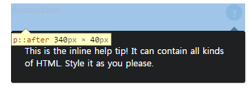
/* 도움말 풍선이 가려지는 것을 방지?
잘은 모르겠지만 이것으로 인해 ?표시 있는 곳 까지
<p> 영역을 확장하게 된다. 아래 그림 참조
*/
.help-tip p:after{
width:100%;
height:40px;
content:'';
position: absolute;
top:-40px;
left:0;
}
/* for animation */
@-webkit-keyframes fadeIn {
0% {
opacity:0;
transform: scale(0.6);
}
100% {
opacity:100%;
transform: scale(1);
}
}
@keyframes fadeIn {
0% { opacity:0; }
100% { opacity:100%; }
}
</style>
</head>
<body>
<div class="help-tip">
<p>
This is the inline help tip! It can contain all kinds of HTML. Style it as you please.
</p>
</div>
</body>
</html>
scss
////////////////////
// Inline Tooltip
////////////////////
.help-tip{
  position: absolute;
  top: 18px;
  right: 18px;
  text-align: center;
  background-color: #BCDBEA;
  border-radius: 50%;
  width: 24px;
  height: 24px;
  font-size: 14px;
  line-height: 26px;
  cursor: default;

  // ? mark which is the sign of the help
  &:before{
    content:'?';
    font-weight: bold;
    color:#fff;
  }

  // for animation
  &:hover p{
    display:block;

    -webkit-animation: fadeIn 0.3s ease-in-out;
    animation: fadeIn 0.3s ease-in-out;
  }

  p{
    display: none;
    position: absolute;
    text-align: left;
    background-color: #1E2021;
    padding: 20px;
    width: 300px;
    border-radius: 3px;  /* round corner */
    box-shadow: 1px 1px 1px rgba(0, 0, 0, 0.2);
    right: -4px;
    color: #FFF;
    font-size: 13px;
    line-height: 1.4;

    // pointer of the tooltip bubble
    &:before{
      position: absolute;
      content: '';
      width:0;
      height: 0;
      border:6px solid transparent;
      border-bottom-color:#1E2021;
      right:10px;
      top:-12px;
    }

    // to prevent from being hidden
    &:after{
      width:100%;
      height:40px;
      content:'';
      position: absolute;
      top:-40px;
      left:0;
    }
  }
}

/* for animation */
@-webkit-keyframes fadeIn {
 0% {
  opacity:0;
  transform: scale(0.6);
 }

 100% {
  opacity:100%;
  transform: scale(1);
 }
}

@keyframes fadeIn {
 0% { opacity:0; }
 100% { opacity:100%; }
}
Bootstrap tooltip
Bootstrap Tooltip (Bootstrap Popover)이 존재한다. bootstrap 을 쓴다면 굳이 다른 것을 쓸 이유는 없을 듯 하다.source
<!DOCTYPE html>
<html lang="en">
<head>
    <title>Tooltip, Popover Example</title>
    <meta charset="utf-8">
    <meta name="viewport" content="width=device-width, initial-scale=1">
    <link rel="stylesheet" href="http://maxcdn.bootstrapcdn.com/bootstrap/3.3.6/css/bootstrap.min.css">
    <script src="https://ajax.googleapis.com/ajax/libs/jquery/1.12.0/jquery.min.js"></script>
    <script src="http://maxcdn.bootstrapcdn.com/bootstrap/3.3.6/js/bootstrap.min.js"></script>
    <style>
        /* to make a circle around the question mark */
        div.tip{
            background-color: #BCDBEA;
            border-radius: 50%;
            width: 24px;
            height: 24px;
            font-size: 14px;
            line-height: 26px;
            cursor: default;
            text-align: center;

        }

    </style>
</head>
<body>

<div class="container">
    <h3>Tooltip Example</h3>

    <div class='tip' data-content="help content is here">?</div>
</div>

<script>
    $(document).ready(function(){
        $('div.tip').popover({
                    trigger: 'hover',
                    'placement': 'auto'
                }

        );

    });
</script>

</body>
</html>
잡담
예전에 google 에서 보이던 '? 모양'의 추가적인 설명은 사라지고, 명확하게 "Details" 나 "자세히 알아보기" 등의 글자에 link 를 걸어놓았다. (물론 다른 색으로)그리고 이 link 를 누르면 도움말 페이지로 간다.그 외에 '? 모양' 을 누르면 종합적으로 검색해서 살펴볼 수 있도록 해 놓았다.
댓글 없음:
댓글 쓰기